ShopDreamUp AI ArtDreamUp
Deviation Actions
Description
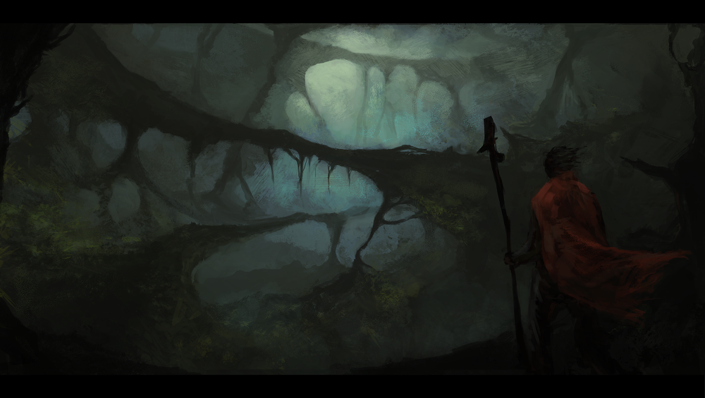
I'm a whore for arches and bridges.
Practicing atmospheric depth and colour.
Hope you like!
Practicing atmospheric depth and colour.
Hope you like!
Image size
1000x564px 502.44 KB
© 2011 - 2024 Broken-Lithium
Comments20
Join the community to add your comment. Already a deviant? Log In
you arch whore...jk man <img src="e.deviantart.net/emoticons/let…" width="15" height="15" alt="
Ok, first take at look your painting but in black and white:
[link]
I reduced it to a very small size so that it's more of a thumbnail. By doing this, you can see what is working and what is not. I also placed it on top of a mid-gray tone so that we can properly discern the values in your painting.
Here's the main issue: values.
Right now, your values are super dark. In fact from a thumbnail size, it's hard to even read or understand what this is about. If your values were brighter, then the scene, and especially the figure would be easier to read.
Probably the best solution is the brighten the scene so that we can better distinguish some of the shapes here. Usually, an environment scene should have a wide range of values, from bright to very dark. Right now, your painting is slightly brighter than mid-gray in the very distant background, and then gets super dark from midground to foreground. The best thing is to even out the "gradient" of values so that it doesn't feel like it's only bright in the vague distance and super dark everywhere else. I suggest evening out the values so that there is flow from light to mid-light to midtone to mid dark to dark, not light to mid-dark and dark. I hope that was not confusing lol
Apart from that...
Vision: I will be frank with you, this is very cliche, it's been done before. Doing cliche content is not bad at all, just remember that when you are going to do something cliche, make sure to make it your own kind of cliche and not exactly what everyone else tries doing.
Originality: Look above.
Technique: apart from your values, I really recommend you research references. Build up a mental library in your head from photographs or observations so your artwork yields more fruition. The more we research the easier we can understand what we are trying to paint and why. For example, if I were to make a jungle-like environment, I would research many different kinds of forests/jungles, different kinds of cool plants, trees, roots, etc from photographs. Deviantart has alot of beautiful jungle photographs that help. Sometimes it even helps to read up on how certain things work, like how jungles function, or what kinds of creatures would live in a jungle and why. All this information, though it may not seem directly beneficial, helps you build a library as to what a jungle is. Instead of relying on what you "think" a jungle looks like, do research and find out what it actually looks like.
Impact: Overall I think it has potential, and I think you are using nice colors. The green-blues complement the red of the cloak. It's a shame it's all so dark. I like the texture, but don't rely on texture to essentially "polish" your painting; always make sure you solve the issues of composition, value, and color. These are the structures of art and nothing you do to "polish" your work will cover up for a lacking composition, or lacking values or colors. Also, the black border is not helping because it makes your work look even darker.


